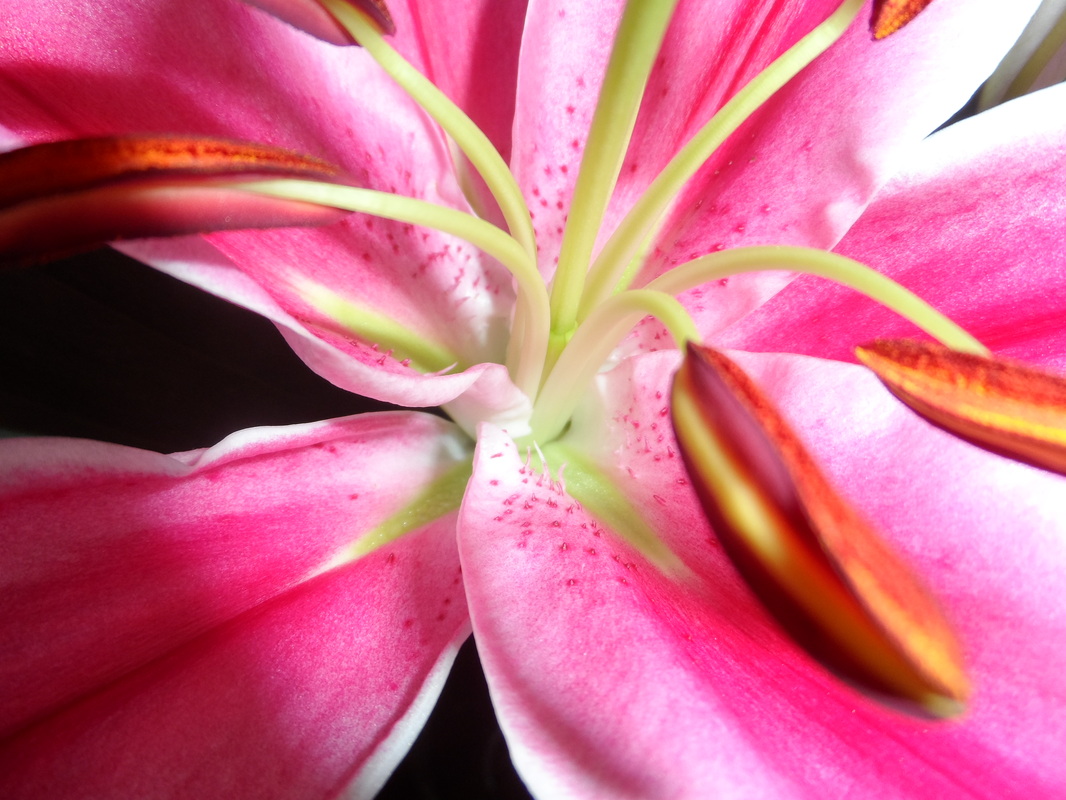
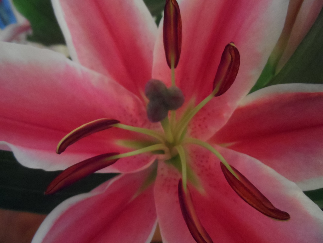
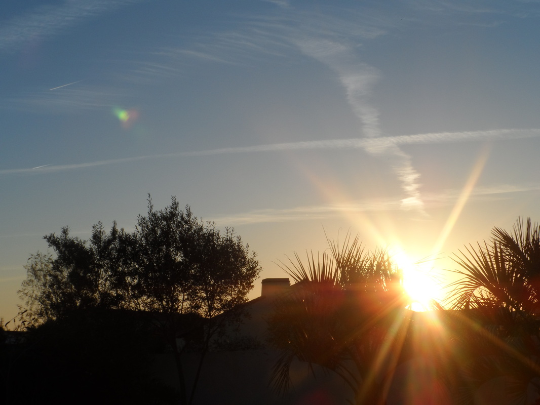
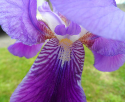
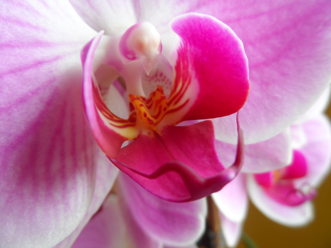
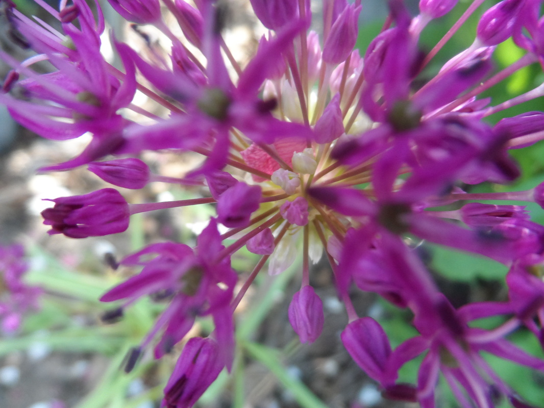
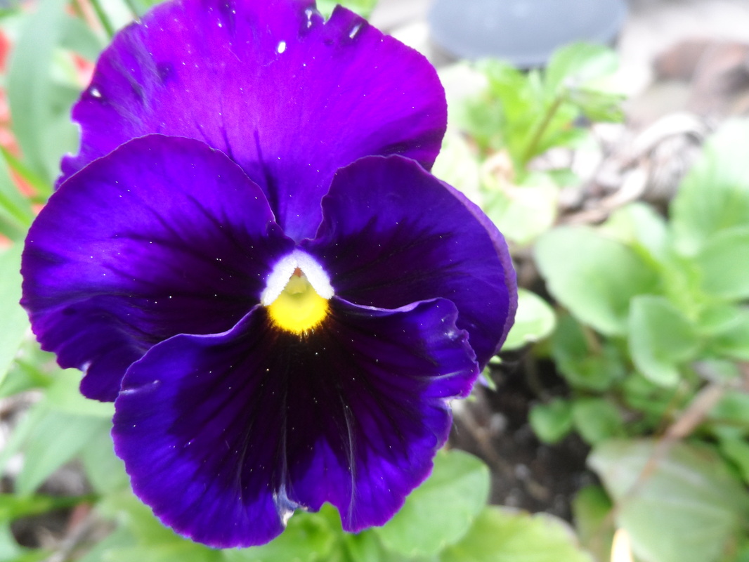
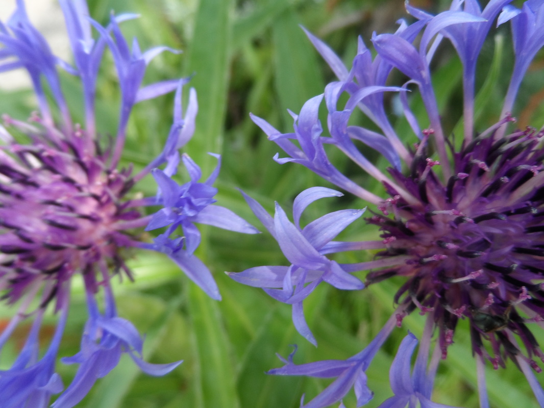
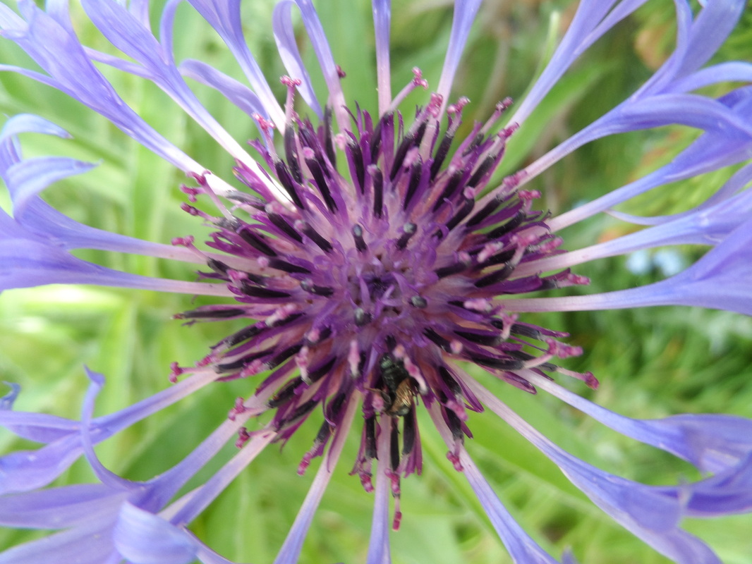
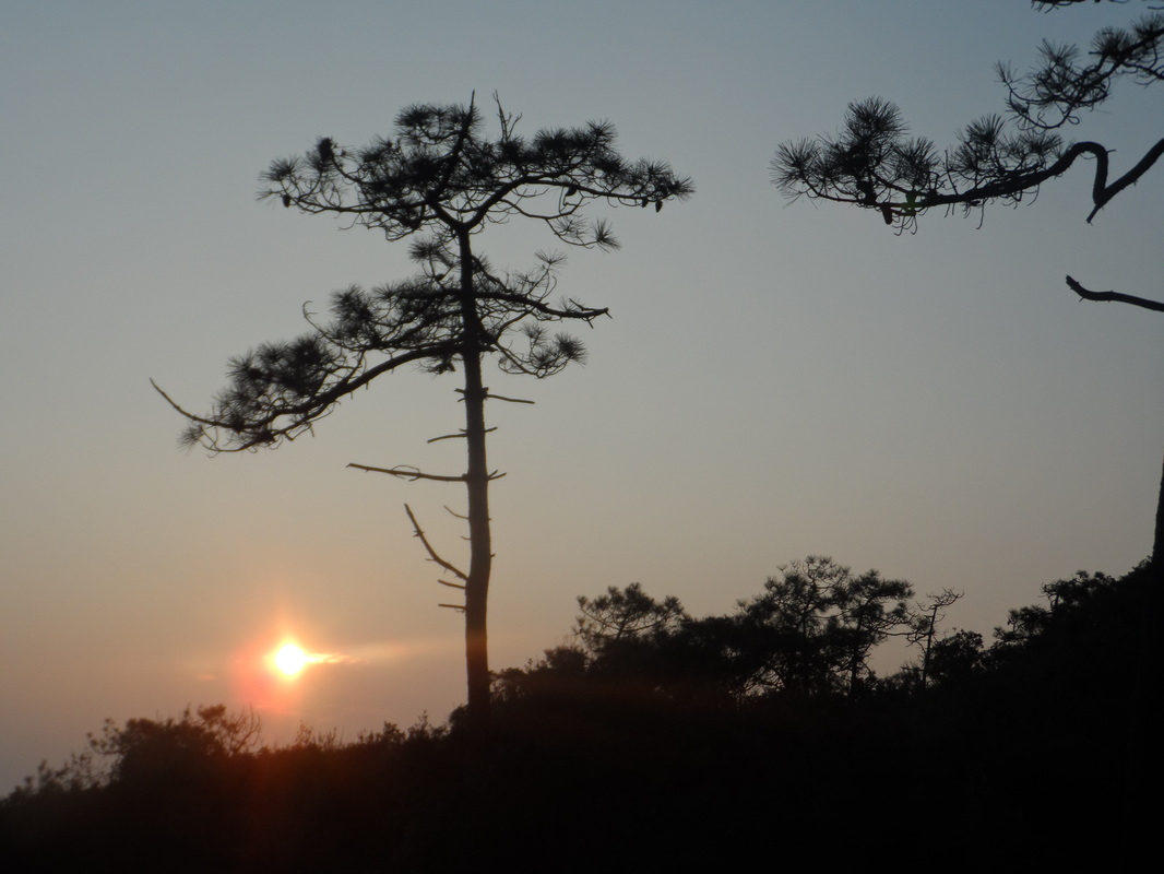
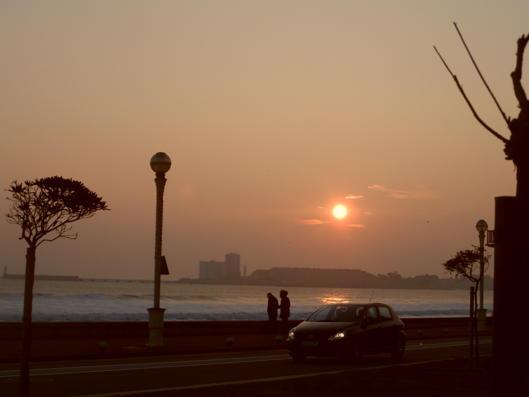
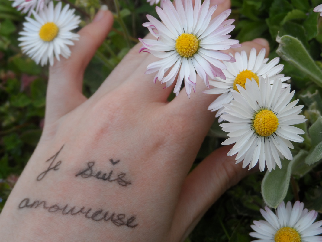
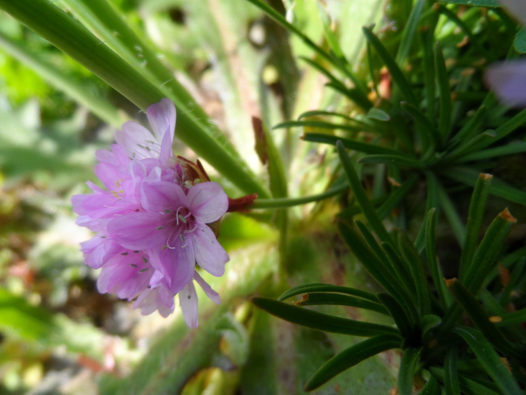
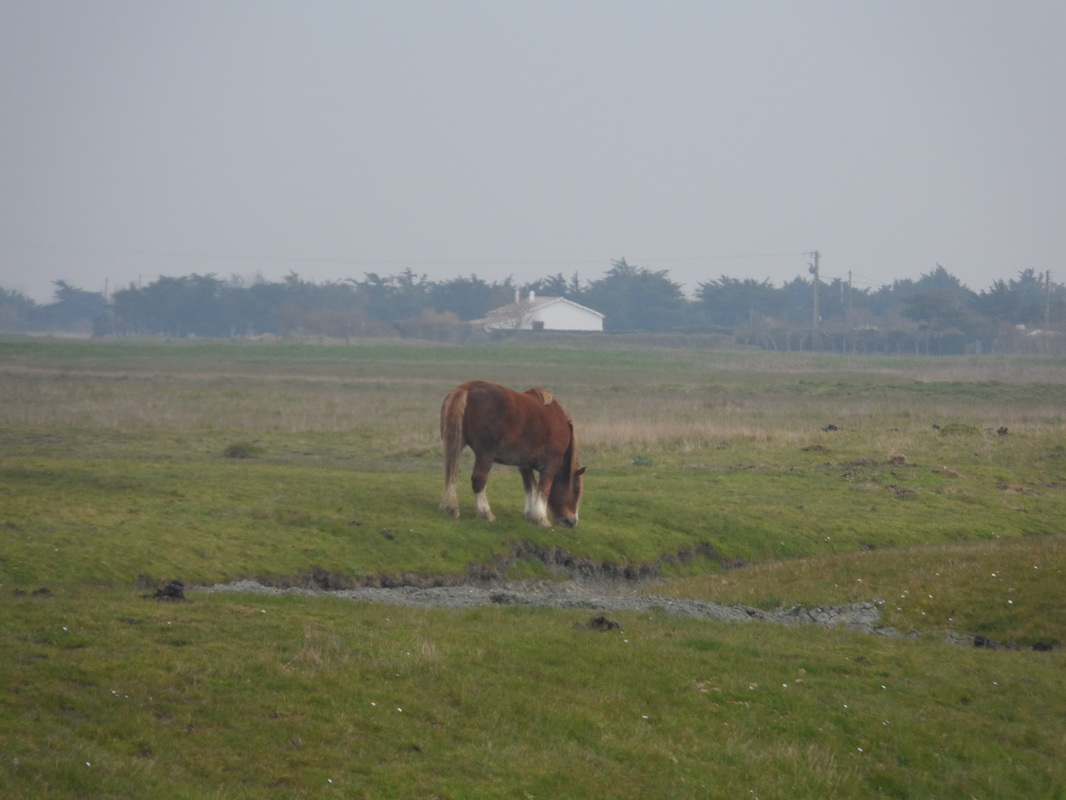
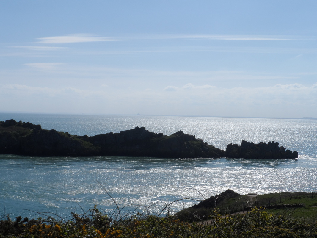
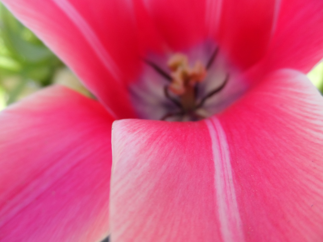
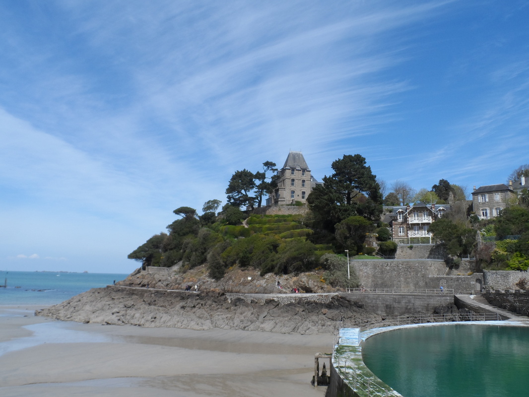
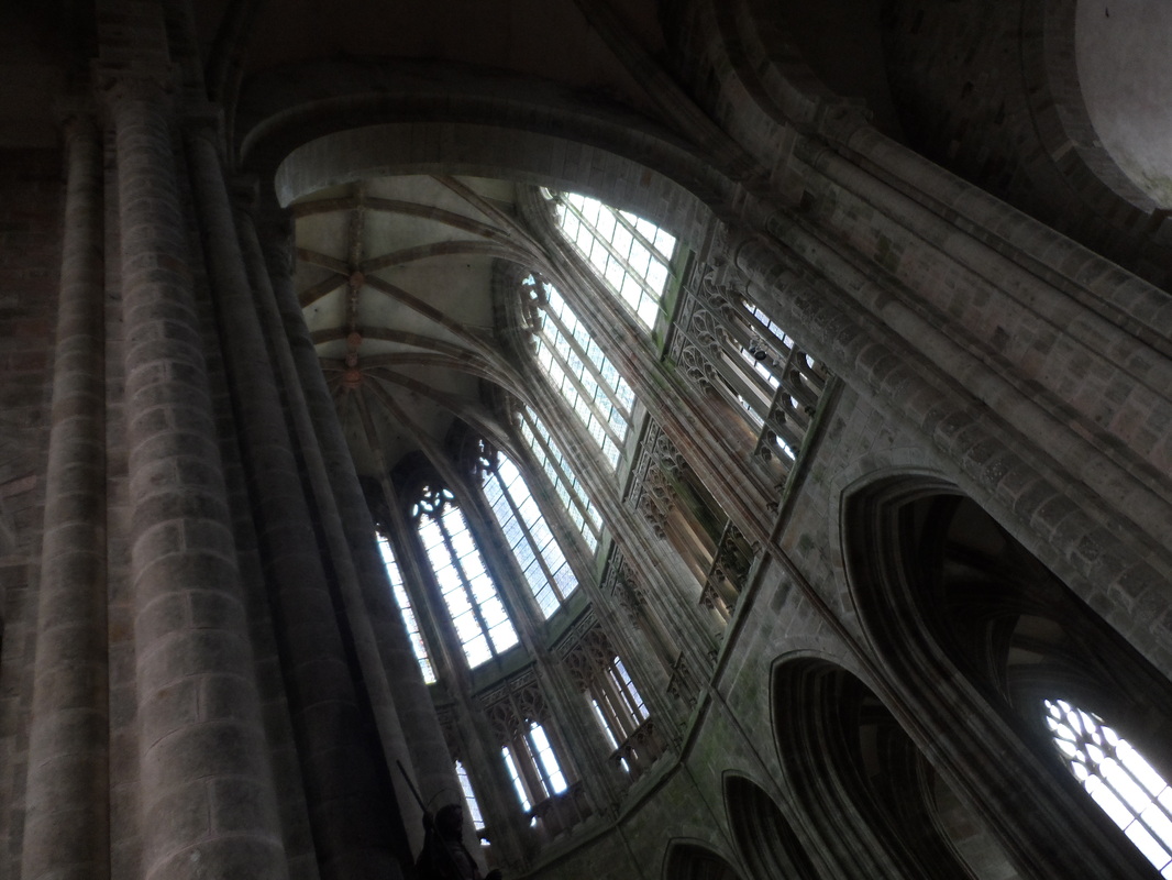
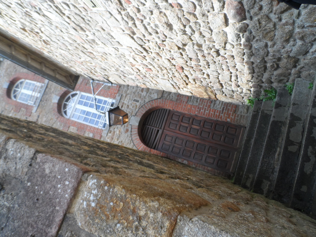
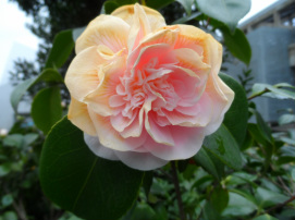
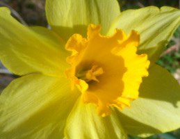
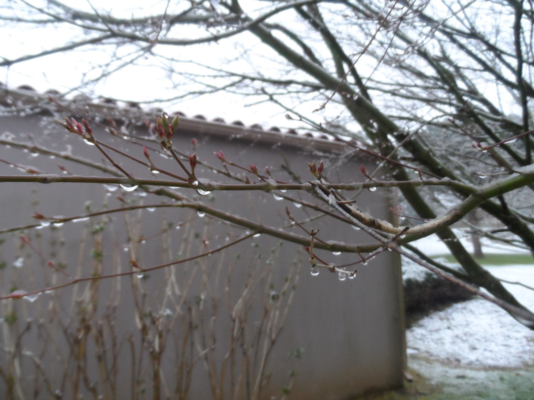
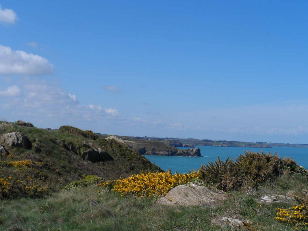
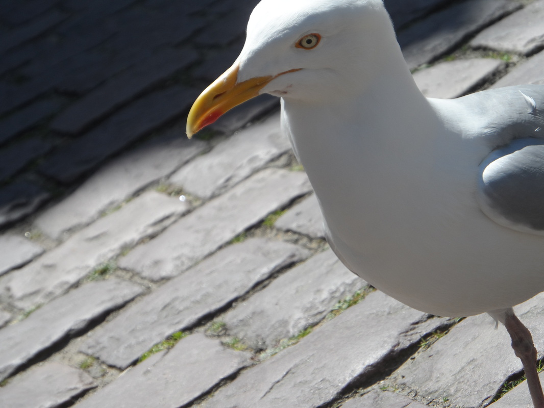
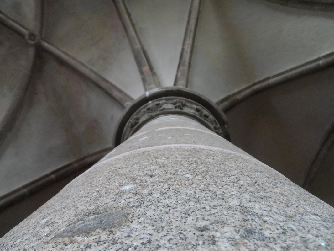
France Artistic Photographs


|


|


|
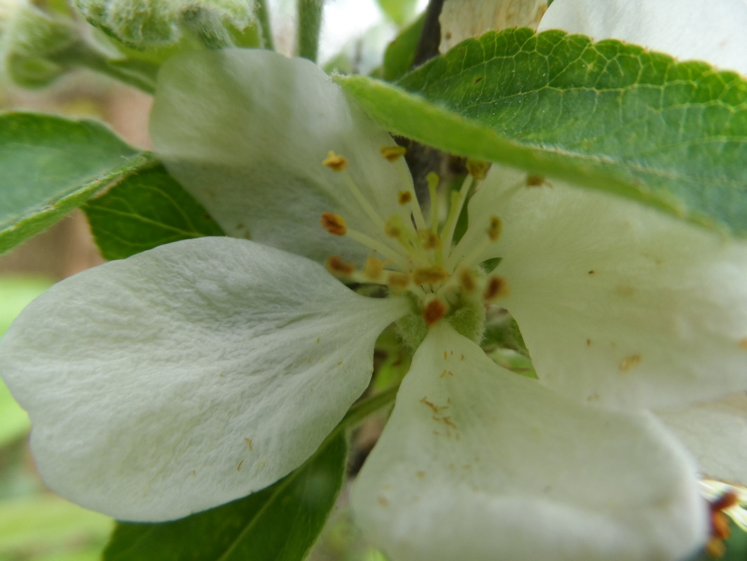
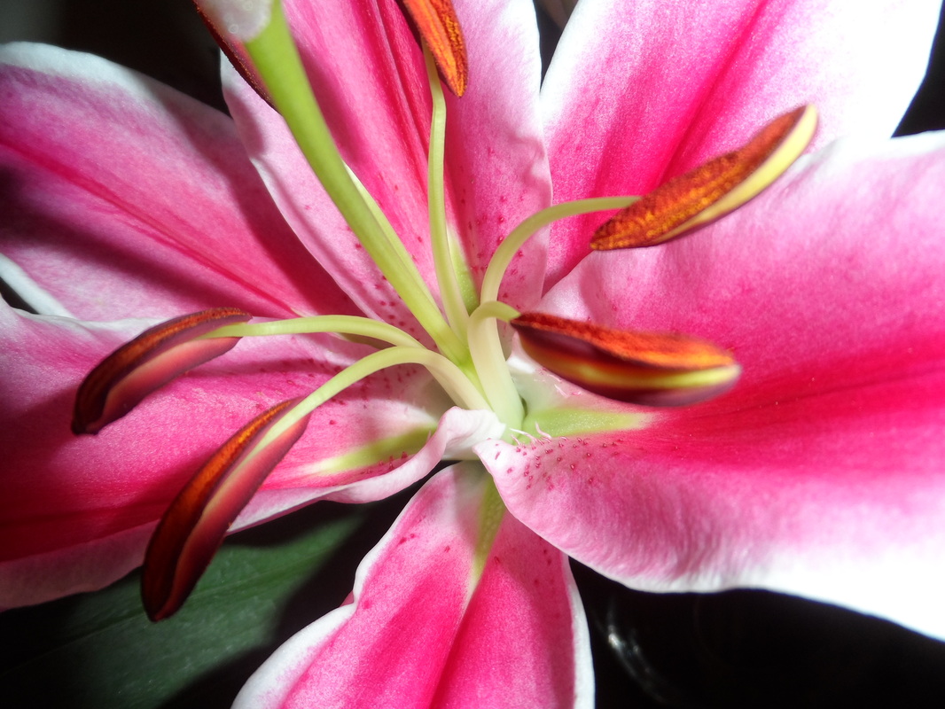
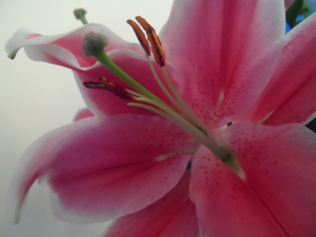
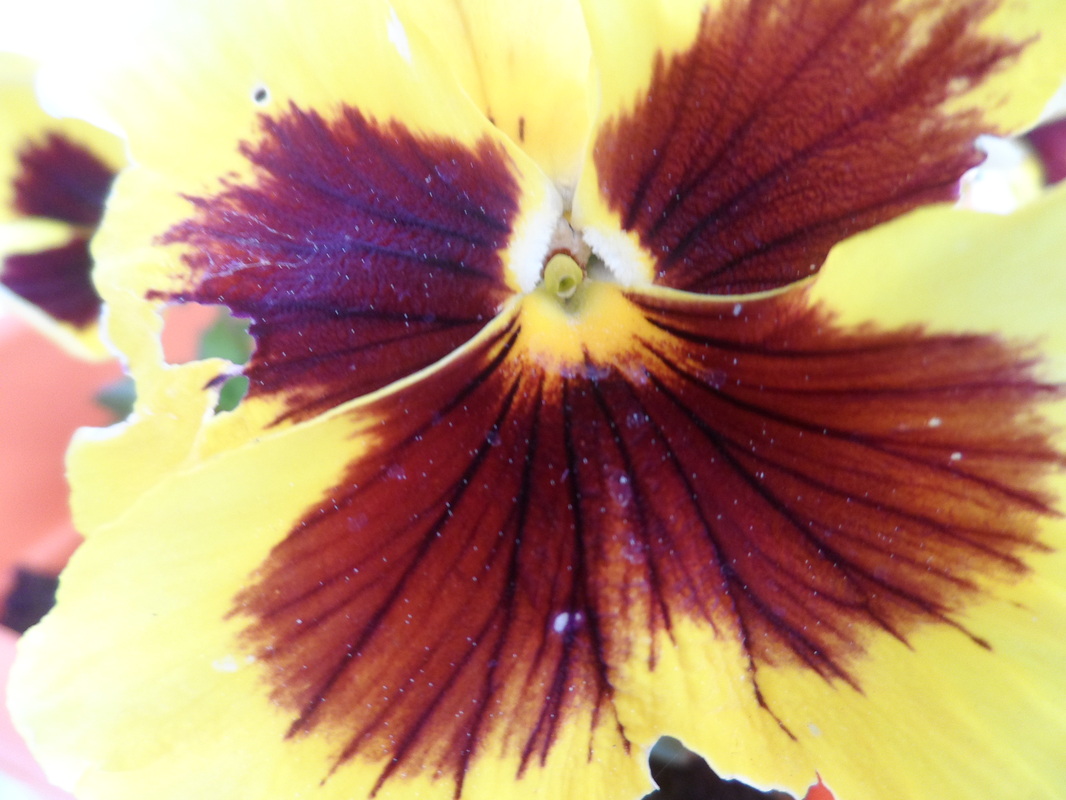
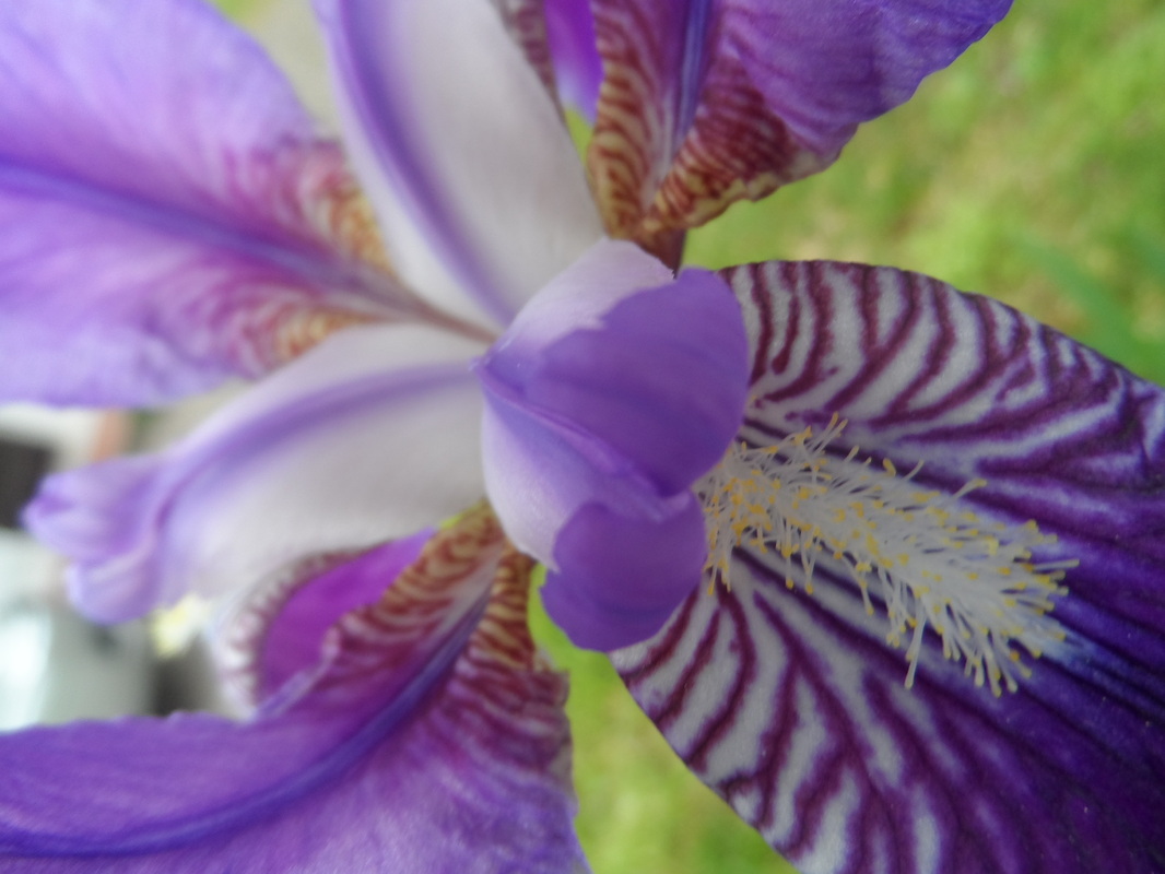
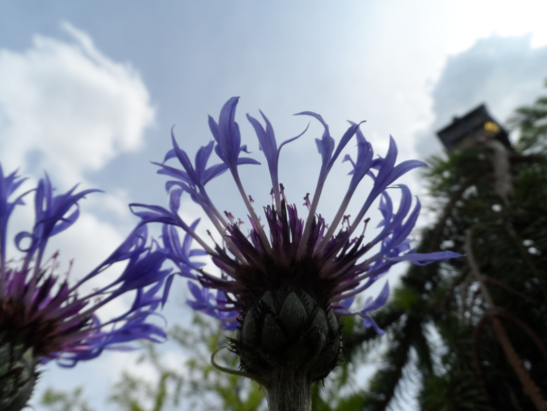
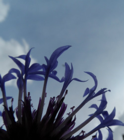
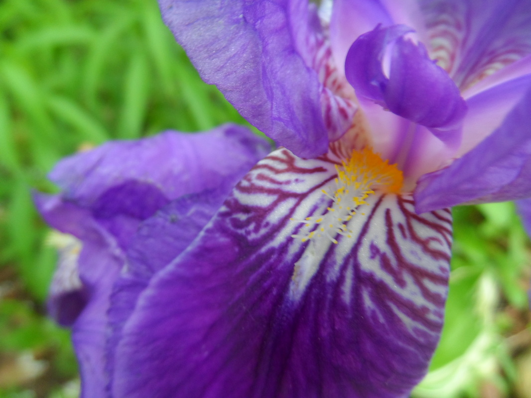
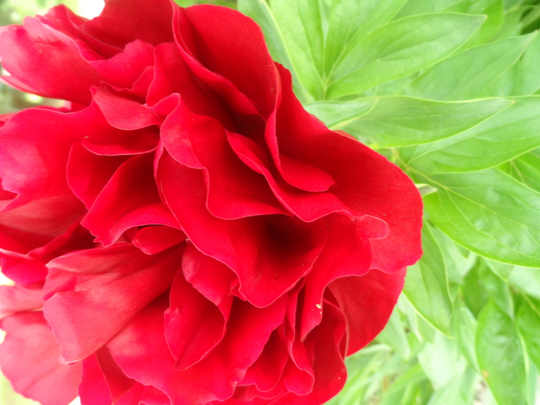
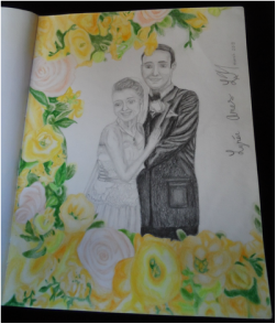
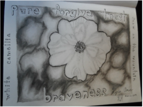
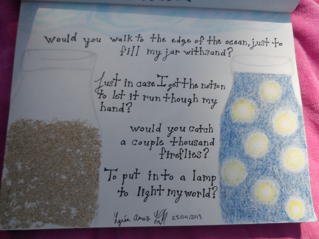
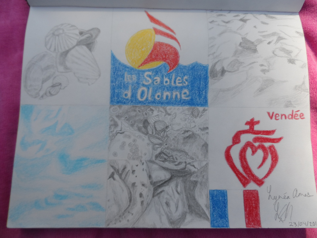
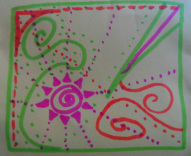
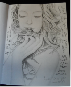
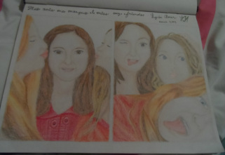
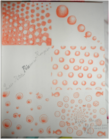
My Art

|
|
|
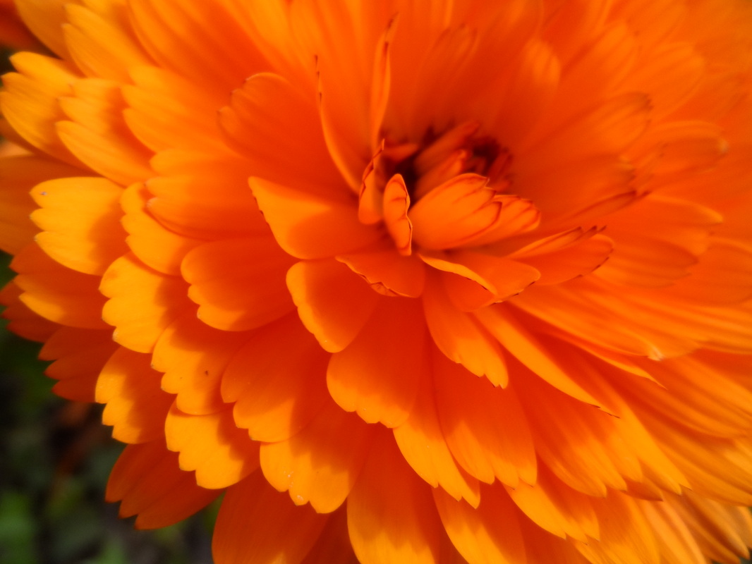
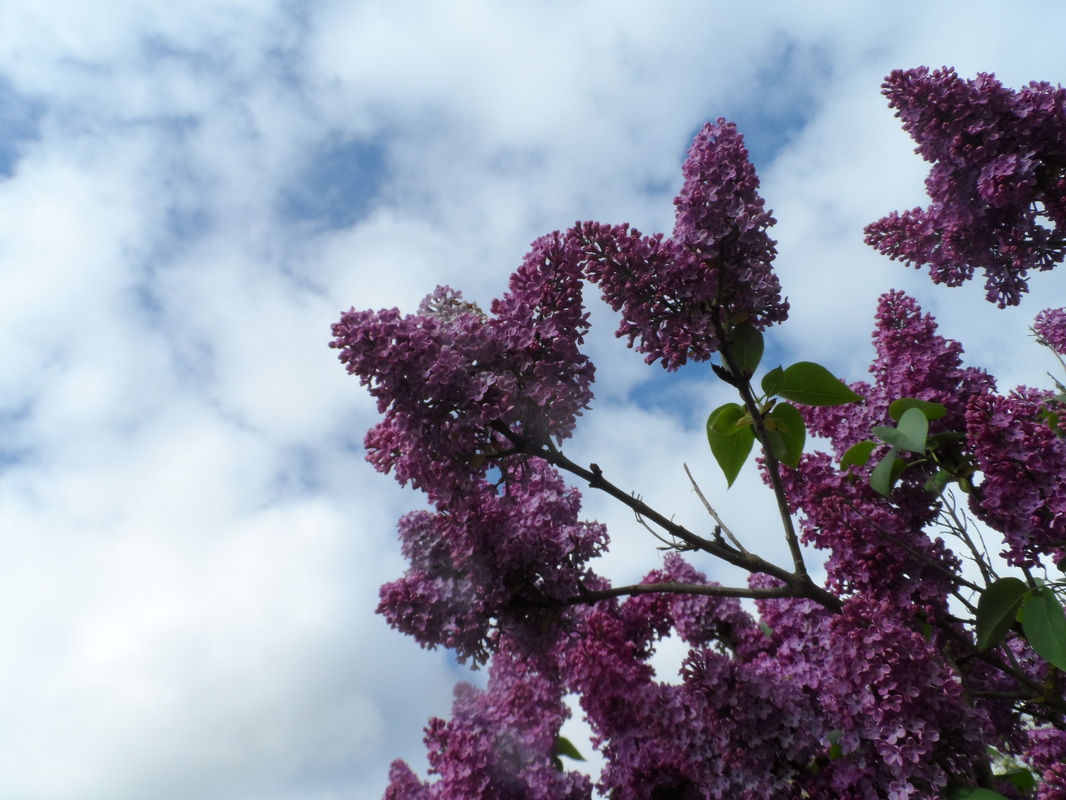
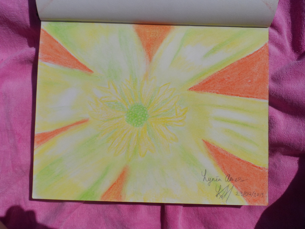
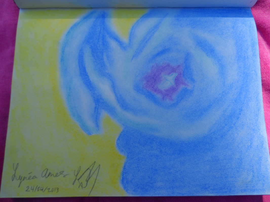
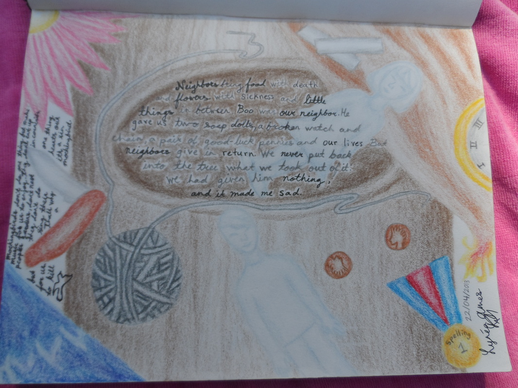
My Art Journals
There is a cheese in France that's called conte, so I laughed really hard at dinner when they offered it to me and I had to explain in Canada we draw with a compressed charcoal called conte instead of it being a food.
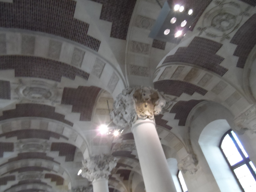
Art in school : In school here visual arts class is called " arts plastiques" meaning plastic arts, because I am in 3éme here (the equaliant to
grade 9) we have done much more art history than creating our own works. We only have one hour of arts plastiques class per week .
We have learned history about the history of the pyramid of Louvre although it was when I first arrived in France and my understanding of what we learned is not very good. We are now learning about Picasso's "Guernica". It is an oil on canvas 780cm × 350cm it was painted from Mai first to June forth in 1937. It was painted as a response to the bombing of the village Guernica in northern Spain during the Spanish civil war by German attackers. The painting is in black, gray, and white which helps Picasso to set a dark mood and express pain and chaos. The painting was commissioned by the Spanish Republican government. Picasso uses a lot of symbolism to show the effects and suffering that war causes; The lantern held by the women coming into the scene from a window symbolizes hope, the flower symbolizes hope and peace the dove symbolizes peace as well. The mother grieving over her dead child symbolizes the murder of innocent civilians who's life are taken by war. For the first work we got to create,we were given a photograph, we were told to recreate the image with an new atmosphere (I just drew/painted the image the same
because my friends forgot to explain that we could change the atmosphere.) Our next project (were only just starting before I leave so I
wont get to do much work for it ) is to take a shoebox, cut a hole in the side for looking inside , and inside we create a nightmare, something
that portrays terror ,sadness ,darkness ,horror but without the use of any blood or dead corpes. Which I thought was an interesting
project because you need to use symbolism and deeper ways to portray the message.
Francais : In French class we looked at a sculpture and a popart artist's impression of the birth of Venus
Spanish : In Spanish on the wall is "las meninas" by Diego Velázquez
In "Les sables d'Olonne": We saw some art in town. One woman had many paintings that she worked using mannerism. She created paintings of women with normal sized and facial features, normal until their chests where she enlarged the proportions, she did this as well with their butts and the most emphasis was on their thighs. After their huge thighs the legs gradually narrowed. This emphasized their womanly features. I believe she called this series of paintings round/beauties, which, which made it clear to me that she portrayed her message well.
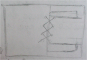
We then saw an exhibit of several artists. One artists work I found very beautiful, it was abstractions that used very vibrant colours and flowed well together, using movement and rhythm very well to appeal to the eye. Another one of the artists created city scenes, I found that artists work very interesting because he used geometric squares everywhere, the images were all created with squares and there was also more squares in the painting that weren't used to create the city images but to just make the painting more interesting with more patterns and movements to follow.He also only used the colour blue, he had whites, blacks, greys and blue. I feel that helped to balance out the intricate designs by not using lots of colours (lots of colours would have made it too busy and hard for the eye to follow). The next artists work was very creative. He worked in abstractions, I found that his use of colours was not appealing to me because I like vibrant bright colours and he used more dull colours, although he worked an aspect that I found to be extremely creative and inspiring. In his paintings he used frames and canvas connected by laces, for example, one of his paintings looked like this:
Art in school : In school here visual arts class is called " arts plastiques" meaning plastic arts, because I am in 3éme here (the equaliant to
grade 9) we have done much more art history than creating our own works. We only have one hour of arts plastiques class per week .
We have learned history about the history of the pyramid of Louvre although it was when I first arrived in France and my understanding of what we learned is not very good. We are now learning about Picasso's "Guernica". It is an oil on canvas 780cm × 350cm it was painted from Mai first to June forth in 1937. It was painted as a response to the bombing of the village Guernica in northern Spain during the Spanish civil war by German attackers. The painting is in black, gray, and white which helps Picasso to set a dark mood and express pain and chaos. The painting was commissioned by the Spanish Republican government. Picasso uses a lot of symbolism to show the effects and suffering that war causes; The lantern held by the women coming into the scene from a window symbolizes hope, the flower symbolizes hope and peace the dove symbolizes peace as well. The mother grieving over her dead child symbolizes the murder of innocent civilians who's life are taken by war. For the first work we got to create,we were given a photograph, we were told to recreate the image with an new atmosphere (I just drew/painted the image the same
because my friends forgot to explain that we could change the atmosphere.) Our next project (were only just starting before I leave so I
wont get to do much work for it ) is to take a shoebox, cut a hole in the side for looking inside , and inside we create a nightmare, something
that portrays terror ,sadness ,darkness ,horror but without the use of any blood or dead corpes. Which I thought was an interesting
project because you need to use symbolism and deeper ways to portray the message.
Francais : In French class we looked at a sculpture and a popart artist's impression of the birth of Venus
Spanish : In Spanish on the wall is "las meninas" by Diego Velázquez
In "Les sables d'Olonne": We saw some art in town. One woman had many paintings that she worked using mannerism. She created paintings of women with normal sized and facial features, normal until their chests where she enlarged the proportions, she did this as well with their butts and the most emphasis was on their thighs. After their huge thighs the legs gradually narrowed. This emphasized their womanly features. I believe she called this series of paintings round/beauties, which, which made it clear to me that she portrayed her message well.
We then saw an exhibit of several artists. One artists work I found very beautiful, it was abstractions that used very vibrant colours and flowed well together, using movement and rhythm very well to appeal to the eye. Another one of the artists created city scenes, I found that artists work very interesting because he used geometric squares everywhere, the images were all created with squares and there was also more squares in the painting that weren't used to create the city images but to just make the painting more interesting with more patterns and movements to follow.He also only used the colour blue, he had whites, blacks, greys and blue. I feel that helped to balance out the intricate designs by not using lots of colours (lots of colours would have made it too busy and hard for the eye to follow). The next artists work was very creative. He worked in abstractions, I found that his use of colours was not appealing to me because I like vibrant bright colours and he used more dull colours, although he worked an aspect that I found to be extremely creative and inspiring. In his paintings he used frames and canvas connected by laces, for example, one of his paintings looked like this:
I thought I would really like to try to create or work with a canvas unique like in his works. Another one of the artists worked in glass. I saw stained glass works which were very good, two that came to mind are a still life of a vase and fruit and a field of poppies they were very realistic which impressed me due to how hard it is to create value within stained glass works. He also created three dimensional glass works such as glass pyramids with colours and cracks on the inside. My favourite of these was the one with cracks and bright blues inside, it was an abstraction but it reminded me of the ocean with the blues and white cracks like the oceans waves it also had an interesting movement about it , I found it very appealing to the eye. The last artist of the exhibit created metal sculptures, I was not very drawn to them because my father creates metal sculptures that are similar to the artists works so I didn't find them to be something new and interesting for me to look at. When my father creates works like that he uses things like old silver wear, old unwanted metals such as jewelry teapots clocks, etc. Some of my favourite of his works are brooch he gave me made of a clock face and metal leaf. I like it because the overlap of leaf and clock create interest and I find the font of the clock to be pretty, I also like the necklaces that he makes out of forks, he bends them and creates movement within the long parts normally used to eat with, I think I particularly like them because I personally am a fan of the movement of swirls and he often uses swirls for those, another series of works he makes that I like is similar to those; he makes brooches that resemble octopus the head/body is the face of a spoon and the leafs are made out of bent forks, he also gives them little faces out of others odds and ends of metal. I like them because they have a nice balance about them that causes the eye to move along with the movement of the shapes and bends without getting distracted, I also like them because I personally like things that are cute, and I find them very cute.
Another exhibit we saw was, '"Les aquarelles de Louis Lunardi" which means that the exhibit is of the water colours of Louis Lunardi, he had a wide range of different paintings that showed different elements of art and design. He had a series of paintings that were shoes made out of flowers, it reminded me of our clay shoes project from last semester. I was impressed by the realism and good value of the flowers despite the odd positioning to create the shoe image. In his paintings he used a mixture of realism and abstractions, for example he would have a realistic subject of the painting but a background of vibrant flowing colours. In one painting of horses, he used browns in some of the horses and reds and warm colours and browns in the background and painting. That gave the viewer a very drastic and powerful feeling (running free along with the wild horses). Another painting I liked the use of colours was one of a girl, the painting used greens, yellows, pinks and blues. The painting was soft and had a lovely flow to it, the girls blonde hair gradually flew into the background and worked perfectly with the abstraction and colours. The pink in the girls face also tied together nicely with the colour scheme . He had some beautiful realistic paintings of Italy, one during the daylight with a soft pinkish light brown for the stones that made up the buildings and floor. Another during the night which had lovely gondolas and port scene lit by lanterns well.
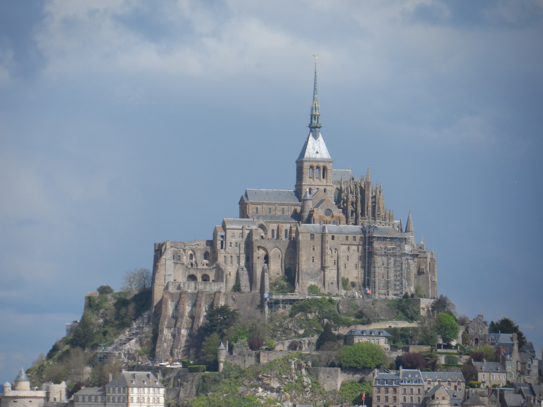
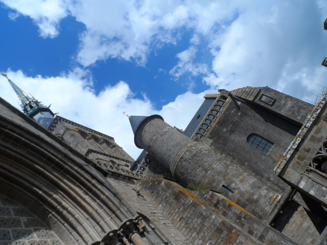
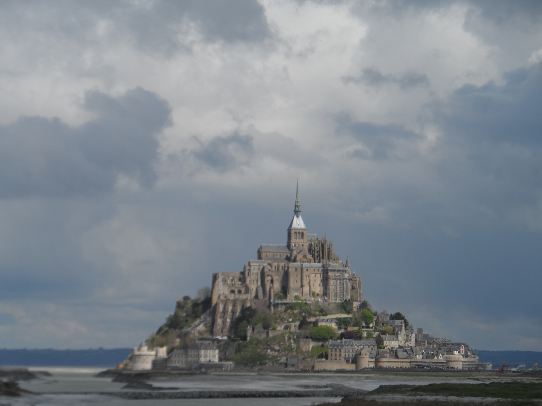
He had another powerful coloured painting which showed the famous French place Le Mont St Michel, it had the moon shining brightly being it and dark violets and reds, I was very impressed by the value regarding it being a night scene and the light source of the moon.
The last artist we saw had a small shop of paintings and furniture. My favourite of her work was cloth custom chairs that she painted parts of to make it look like the chair had big buttons holding it together and the other that looked laced together with ribbons, I was very impressed by the realism of the value and how it looked to actually have the features she had painted. I also fell in love with her canvas painting of a jelly fish it was dark with the luminescence of the jelly fish as the painting's emphasis, she uses blues and white within the painting. I liked that she used realism for the jelly fish but not for the background where she used splatters (I personally am a fan of splatter paintings).
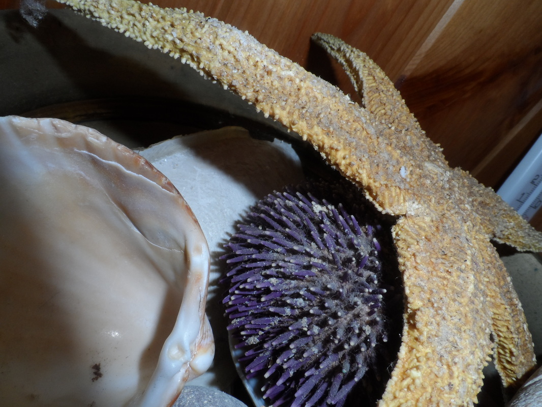
Le Petit Maison de les Sables d'Olonne: My host family owns little house near the sea that we went to for vacations inside the house there are many decorative accents all with the theme of the beach and the sea, almost like the house was one big sketchbook with an ocean theme:
Another exhibit we saw was, '"Les aquarelles de Louis Lunardi" which means that the exhibit is of the water colours of Louis Lunardi, he had a wide range of different paintings that showed different elements of art and design. He had a series of paintings that were shoes made out of flowers, it reminded me of our clay shoes project from last semester. I was impressed by the realism and good value of the flowers despite the odd positioning to create the shoe image. In his paintings he used a mixture of realism and abstractions, for example he would have a realistic subject of the painting but a background of vibrant flowing colours. In one painting of horses, he used browns in some of the horses and reds and warm colours and browns in the background and painting. That gave the viewer a very drastic and powerful feeling (running free along with the wild horses). Another painting I liked the use of colours was one of a girl, the painting used greens, yellows, pinks and blues. The painting was soft and had a lovely flow to it, the girls blonde hair gradually flew into the background and worked perfectly with the abstraction and colours. The pink in the girls face also tied together nicely with the colour scheme . He had some beautiful realistic paintings of Italy, one during the daylight with a soft pinkish light brown for the stones that made up the buildings and floor. Another during the night which had lovely gondolas and port scene lit by lanterns well.
He had another powerful coloured painting which showed the famous French place Le Mont St Michel, it had the moon shining brightly being it and dark violets and reds, I was very impressed by the value regarding it being a night scene and the light source of the moon.
The last artist we saw had a small shop of paintings and furniture. My favourite of her work was cloth custom chairs that she painted parts of to make it look like the chair had big buttons holding it together and the other that looked laced together with ribbons, I was very impressed by the realism of the value and how it looked to actually have the features she had painted. I also fell in love with her canvas painting of a jelly fish it was dark with the luminescence of the jelly fish as the painting's emphasis, she uses blues and white within the painting. I liked that she used realism for the jelly fish but not for the background where she used splatters (I personally am a fan of splatter paintings).
Le Petit Maison de les Sables d'Olonne: My host family owns little house near the sea that we went to for vacations inside the house there are many decorative accents all with the theme of the beach and the sea, almost like the house was one big sketchbook with an ocean theme:
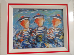
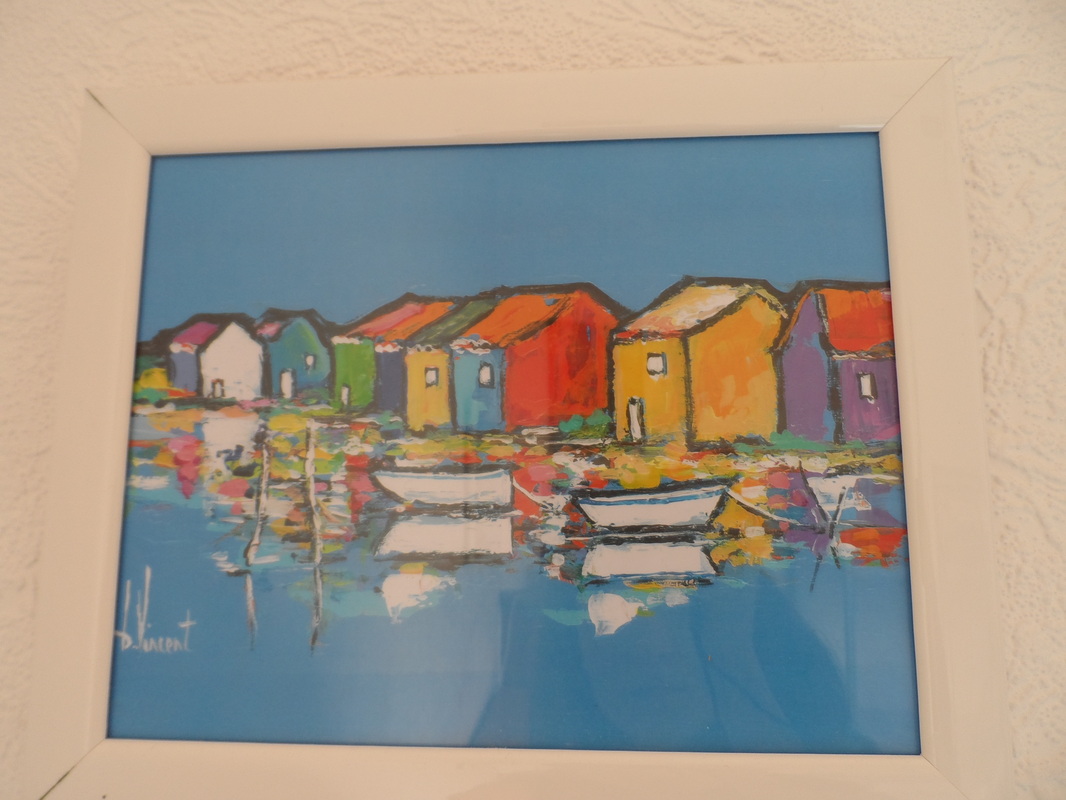
This painting shows three sailors, the artist Vincent portrays the image without giving them faces, the brush strokes are jagged and the sailors gradually turn into colourful strokes. I like how even with this abstract feel to it, Vincent also has some light source from the right side and stays in the realism of the light source.
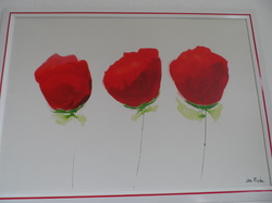
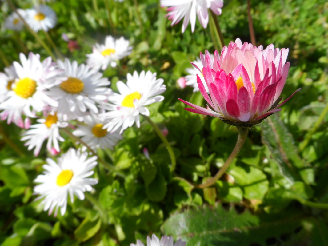
This painting shows three red flowers it has a simpleness to it. The red framing border helps to bring out the red of the flowers. By staying simple with the background and making the stem and unrealistic to hold up the flowers, it emphasizes the flowers.
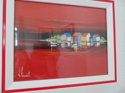
This is another painting by Vincent. It shows the coast at sunset. The red is very strong but balanced by its reflection in the water. The painting has an almost symmetrical balance horizontally but the reflection is blurred to keep the realism of the water.
This painting shows many people and their reflections in the water on the ground.
It has many bright colours and is tied together by the frame accenting the reds.
It has many bright colours and is tied together by the frame accenting the reds.
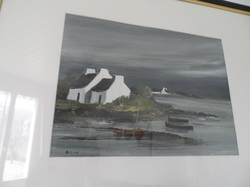
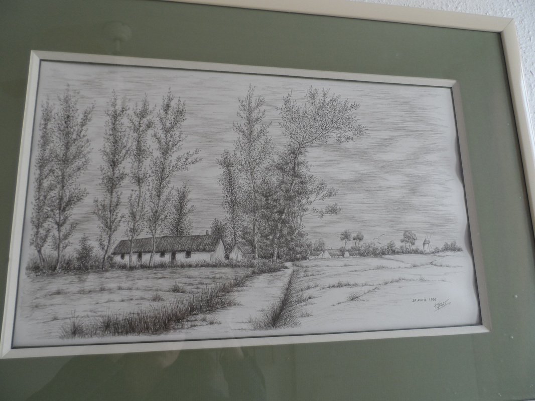
I feel this painting has a nice composition if you look at it with the rule of thirds. It is separated into the gray water, the green land and house and then the gray sky which also helps to balance the colours. Close to the rule of thirds intersections, ideas have been placed to give it more interest. The painting is heavier to the left side.
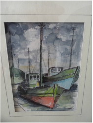
This painting is very drastic and unblended. The boats are nice together because of the green. The blue works well with the grays and the red emphasizes the boat and the centre of the painting.
|
|
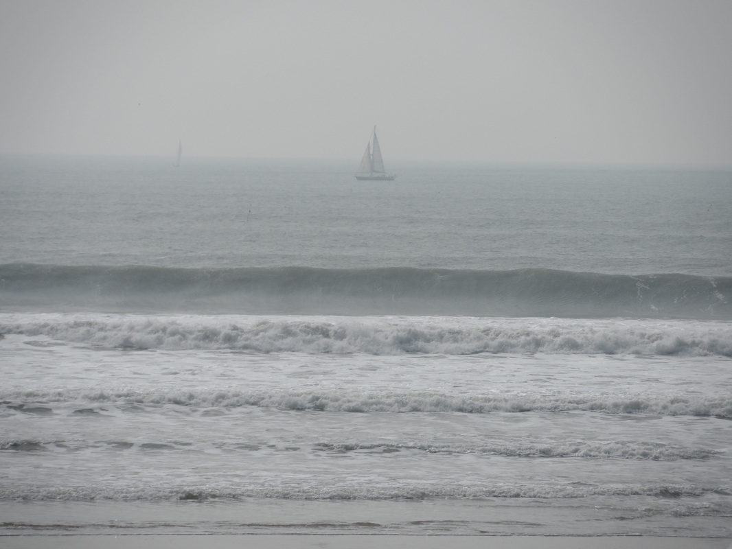
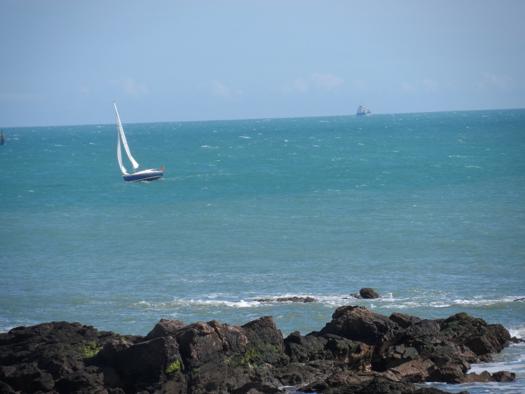
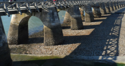
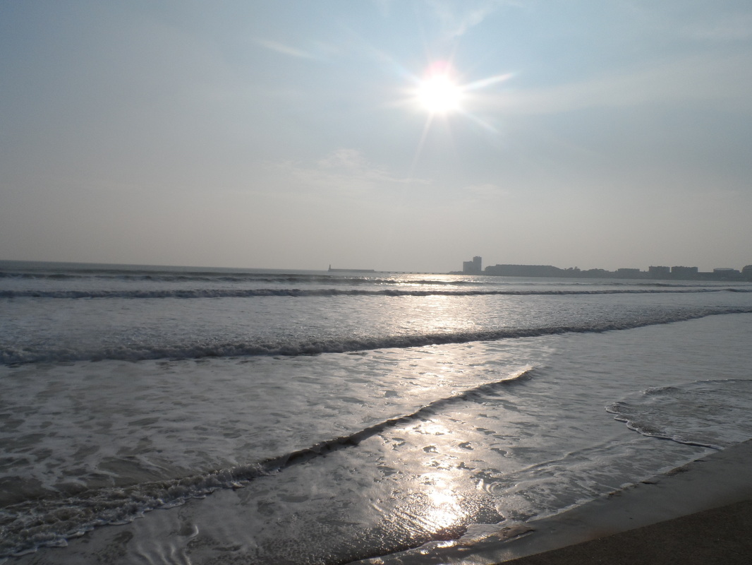
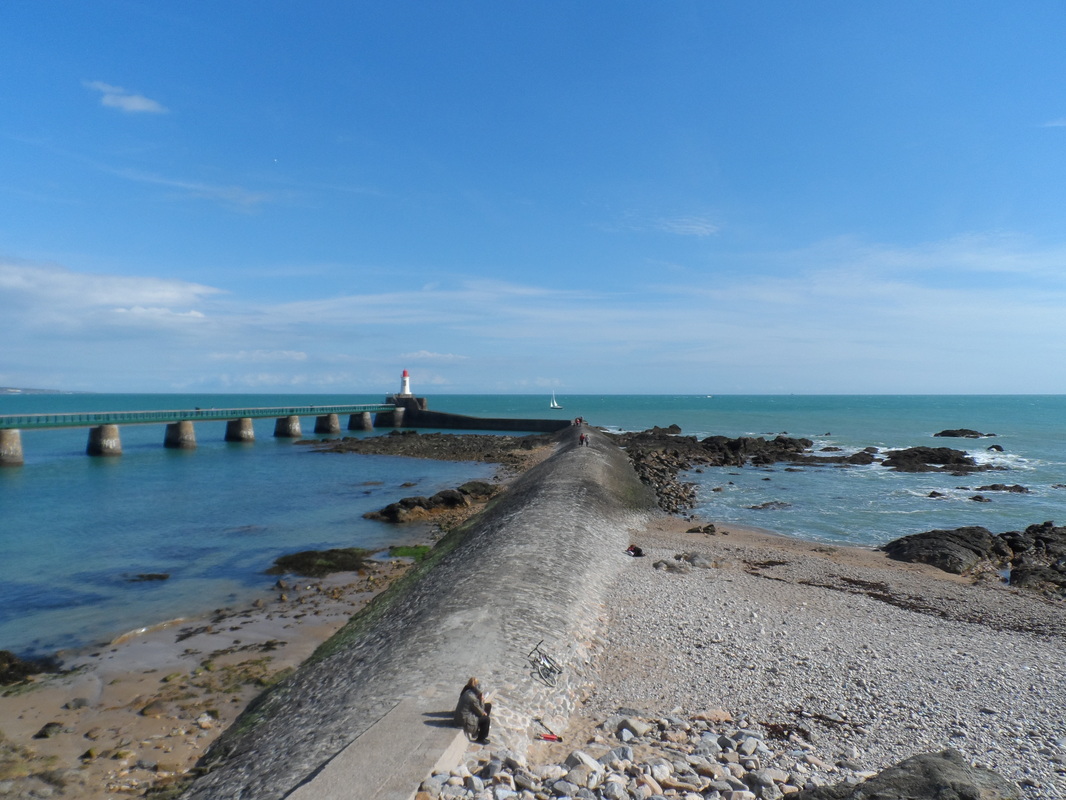
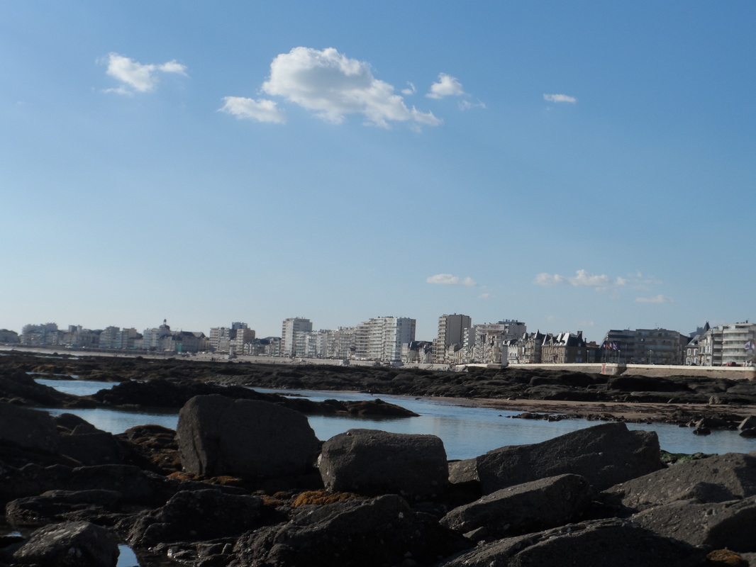
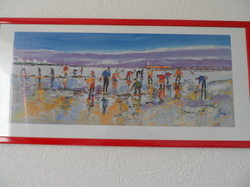
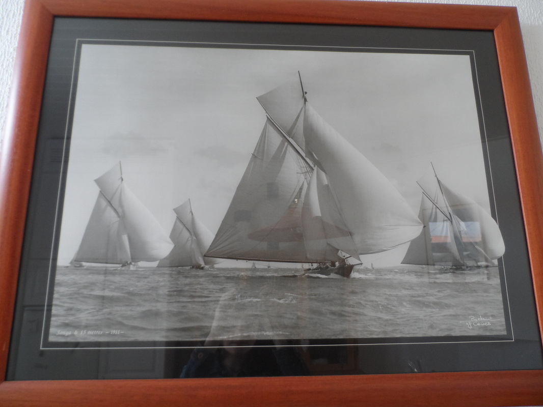
I really like this photograph because it has a range of different boats. It has good overlap. My favourite part is on the right where the boat's sail exceeds the boundary of the painting. It really takes the expression "thinking outside the box" literally.
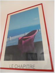
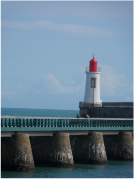
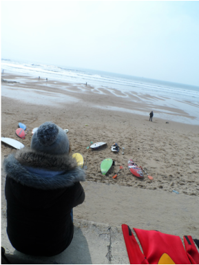
I really like this photograph as well. I feel it has a good use of foreground, middle ground and background. The blue sky and the blue water form the background. The stone fence and the grass are in the middle ground and the red chair is in the foreground. It is tied nicely with the red chair and the red frame.
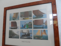
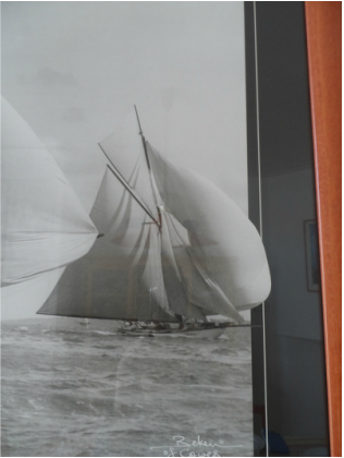
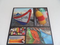
These photos all show similar subjects. The use of the same colours helps tie them together as well. It shows a lot of interesting shots of the sailboats.
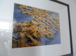
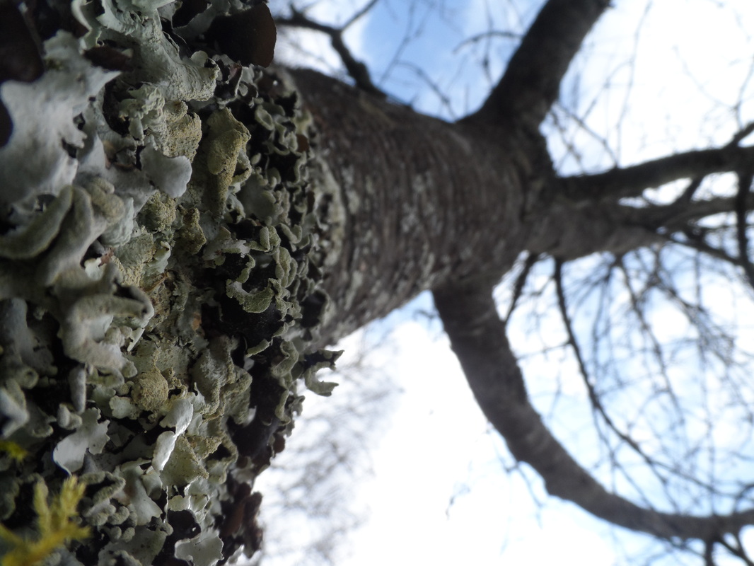
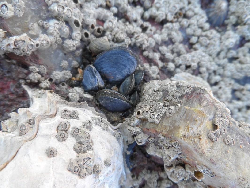
This photograph is a close-up of sea weed spread out over rock. I find it interesting because of its shape and the way the rock shows through. It has a lot of good texture to it.
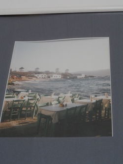
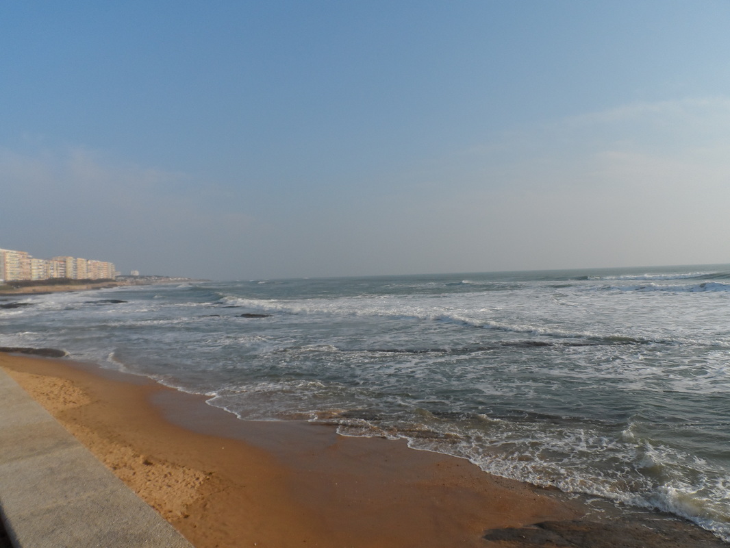
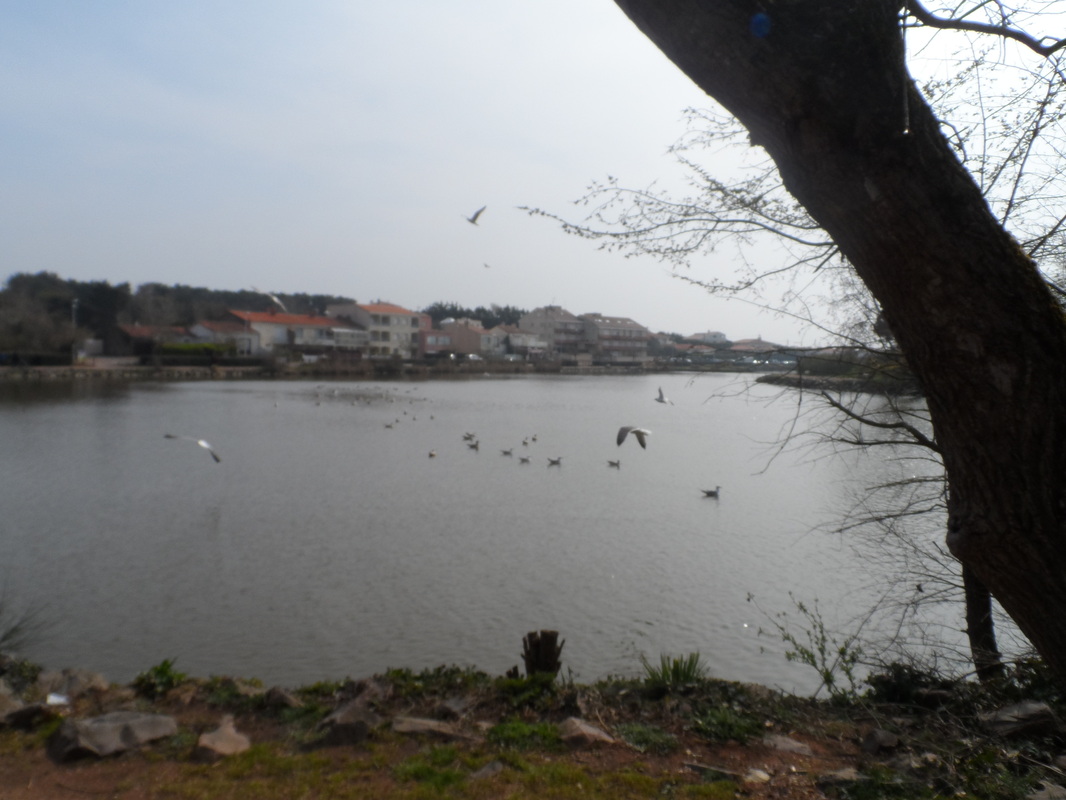
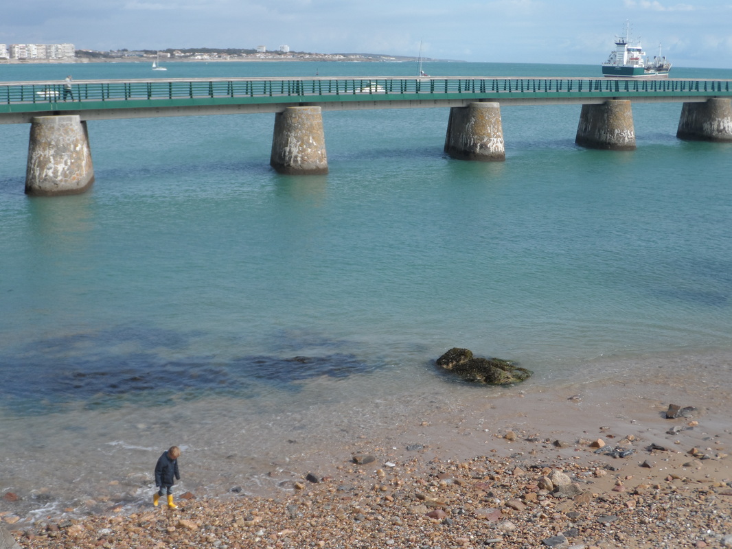
This photograph makes good use of foreground, middle ground and background. The tables are in the foreground. The sea in the middle ground. In the distance the houses, the land and the sky form the background. The water works well with the frame's colour outline.
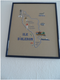
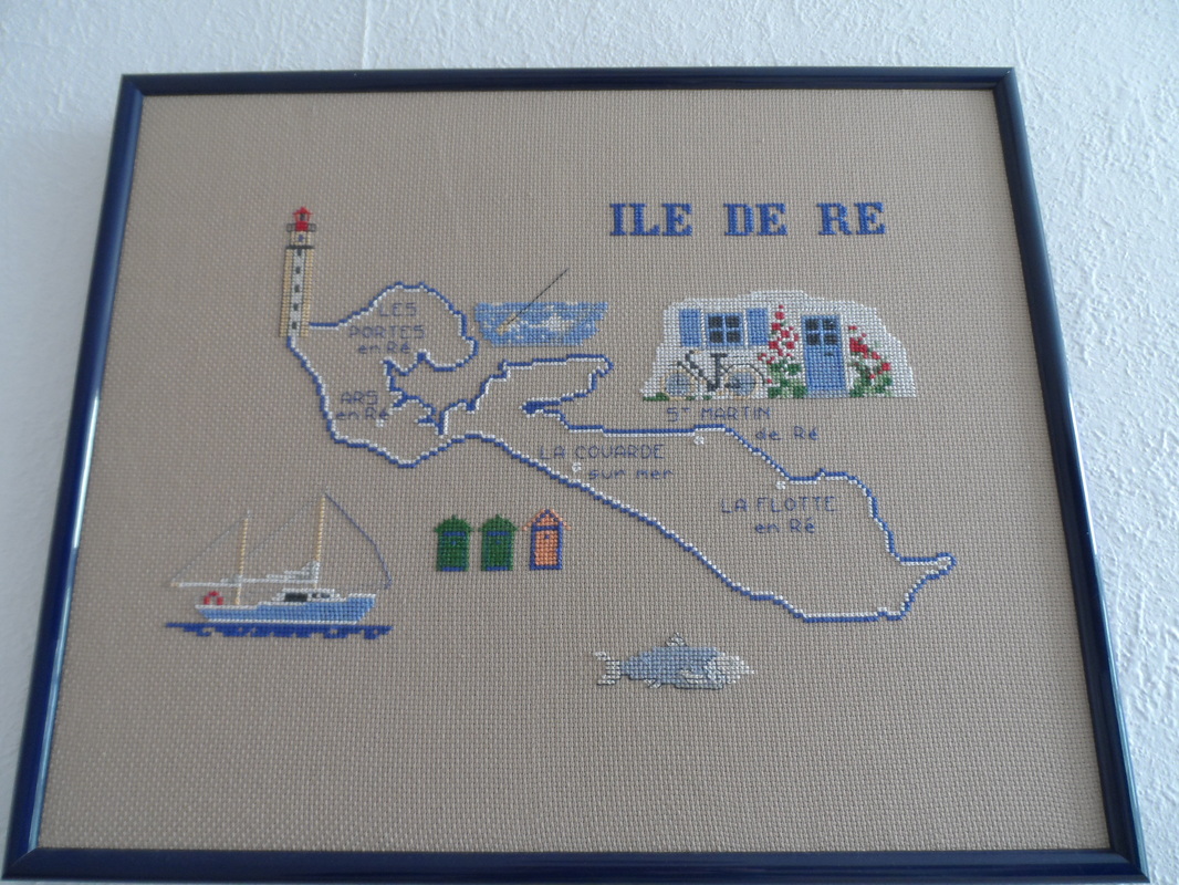
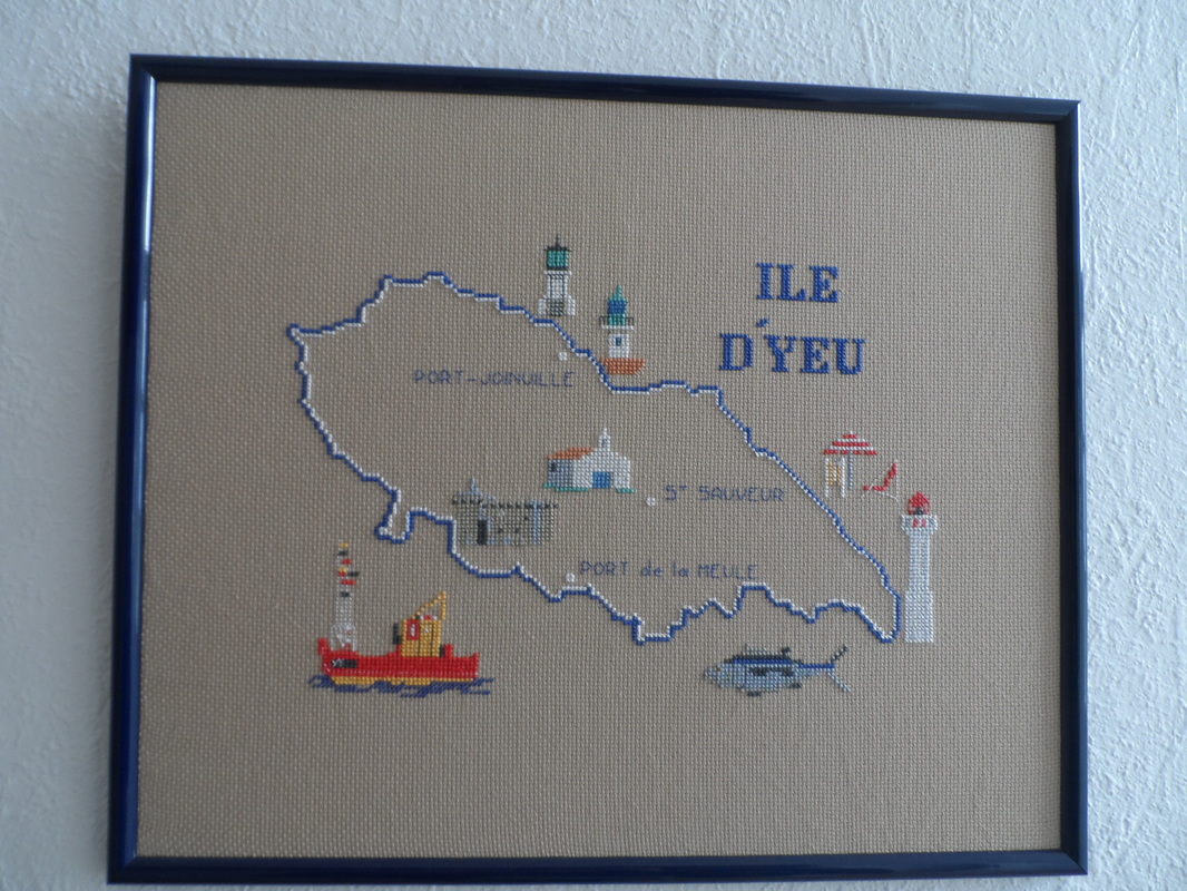
These are needle points of three french islands that my host family's made while she was pregnant with my exchange partner Louise. It has small images of things that have to do with the island. The font is very block-like and dark which gives it interest.
|
|
|
This is another painting by Vincent. It is very simple and shows a wide range of bright colours which are balanced by the colours at the bottom of the painting. He uses pattern well in this painting.
These photographs are outlined by an even black line. It has similar colours that tie together.
|
|
In this photo Louise's shirt reminded me of Roy Lichtenstein's colour blocking.
